
The responsive redesign of a global multi-million dollar ecommerce giant
Garmin.com is a huge ecommerce site with over 300 million hits a year. It's one of the top 1,000 most visited sites in the world, the top 5 consumer electronics sites globally, generating millions of dollars of revenue a year. Redesigning the site was as difficult, politically charged, involved, and thrilling as you can imagine.
The redesign and restructure of such a large site involves the work of several teams, and lots of people. Operating as a team of three, Chris Partise, Katie Heinie, and I led the design and UX while working alongside business marketing clients, UX teams, and IT implementation teams for over a year.

Garmin.com has over 30 million visits a month, so we had access to an abundance of user stats, user research, and business goals to consider from the beginning. We spent hundreds of hours reviewing analytics, in kick-off meetings, pitching things, on phone calls, in stand-ups, user testing, prototyping, outlining, and wire-framing in preparation for the redesign.
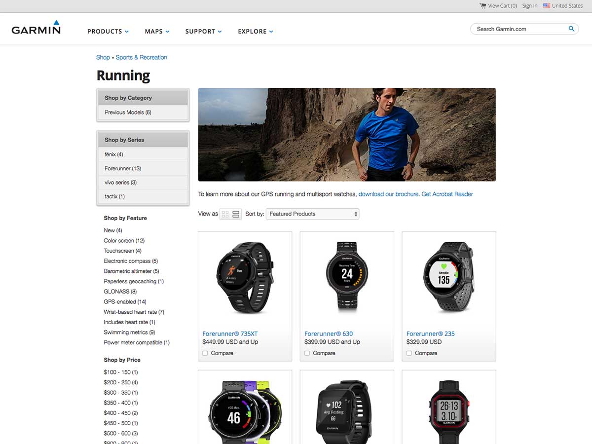
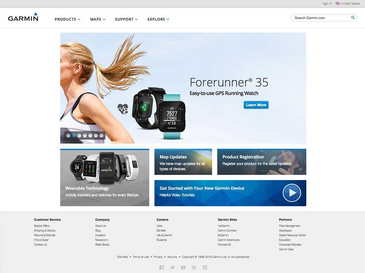
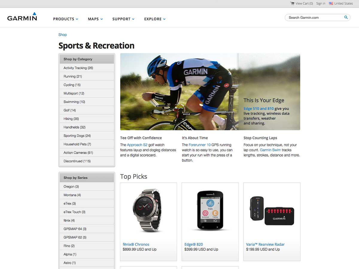
When we did an exploration and analysis on the UX of garmin.com and the buying experience, we identified 3 main areas of focus for the redesign. Because this was the first responsive design of garmin.com, we had to work hard to guide stakeholders through viewing things as an experience translating across the site – no matter the device.
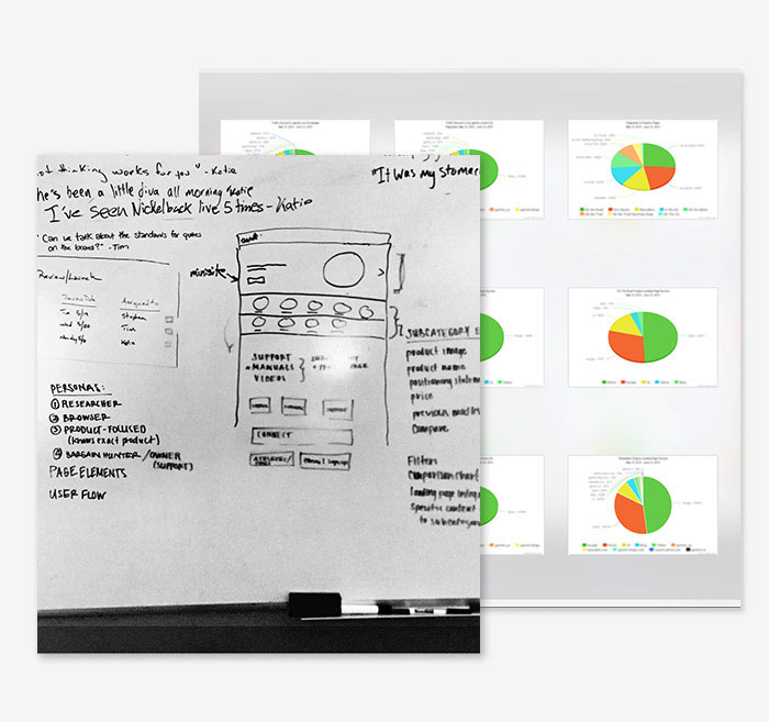
This wasn't simply an aesthetic or interface overhaul. Using content-outlines, analytics, user-data, user tests, and wireframes, we were able to prioritize content and appropriately re-factor it throughout the site.
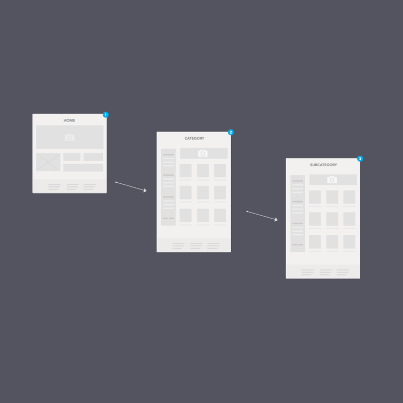
One of the best parts of redesigning the site was the opportunity we had to restructure the way a user experienced information on garmin.com. We were able to to enrich pages, while simplifying the output - guiding users through a process of awareness, consideration, and purchase.
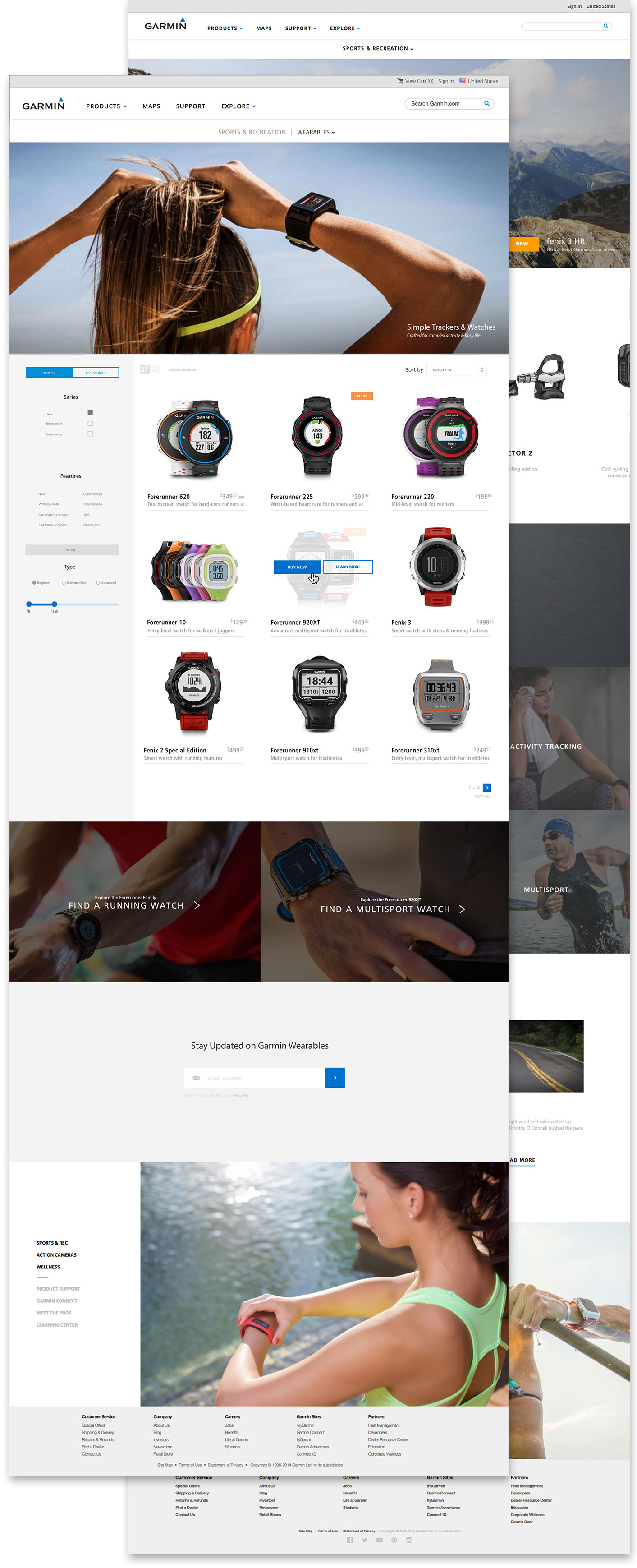
This was the first fully-responsive design on garmin.com. Before, a separate mobile experience was generated using a system that browser sniffed, fully loaded the desktop version of a page, then loaded a separate mobile-specific page on top of every single page.
The decision to design the site mobile-first led to giant improvements in terms of performance as well as experience. Emphasizing a cohesive experience – meaning desktop, mobile, tablet, and phablet felt like a part of the same site – nothing was removed on mobile, just reorganized.
This wasn't my first project getting dirty with enterprise e-commerce, but it was certainly one of the most complex. From a technical standpoint, reformatting the information architecture and redesigning the site required interacting with and working through several different CMSes/systems that each had their own teams, processes, and tooling.
The technical complexities were only a portion of the equation – from navigating the murky political waters of a Fortune 500 tech company, to ADA compliance, it was truly a group effort. Although we handled the design, UX, and prototyping, we looked to several of the many wonderful IT & business teams at Garmin for front-end integration, translation, back-end support, and implementation details.