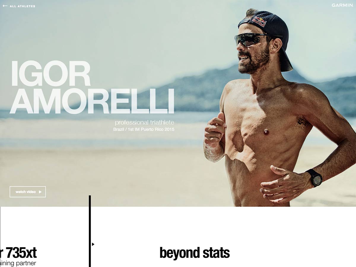
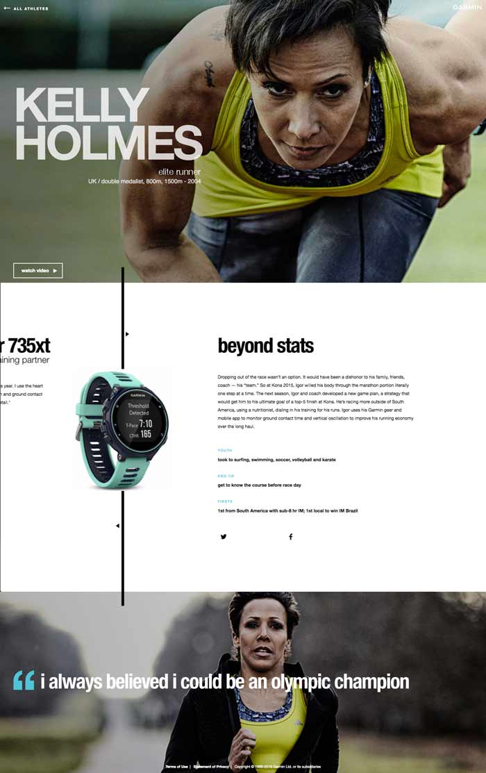
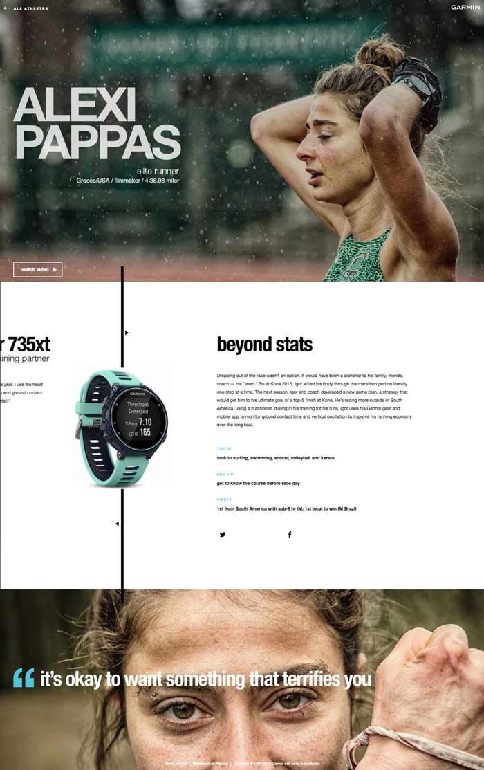
7 world class athletes, 7 stories of struggle & redemption, 1 Forerunner.
The Garmin Turning Points campaign focused on stories from 7 elite athletes. Each story highlighted a specific 'turning point' in the athletes career, a sort of 'do or die' moment. The site was launched in tandem with the release of Garmin's Forerunner 735xt, a watch designed for elite runners & triathletes.
Alongside Tommy Short, Mellissa Mulligan, and Rebecca Sommers (who helped with video & media for the project), I led the design, development and UX for this project.


With media running in over 30 countries, Turning Points was a truly global campaign. In a static site model, supporting 27 translations is like supporting 27 different websites. Working with our European team, we were able to re-architect our tooling and translate the site across 27 locales.
We needed something that would introduce users to the idea of the campaign, and equally as important, introduce the Forerunner 735xt. Using Greensock, I was able to animate HTML 5 elements to create an intro that also served as a loaded for other elements.
Each athlete had a story about a moment in their career they considered a Turning Point, outlined in a biographical-style video. Highlighting quotes on the athletes page helped draw a focus to the athlete's unique stories of struggle and redemption, their turning points.
The entire app was built with the idea of being a single page experience. Despite not using a framework, I was able to utilize tools like AJAX, the HTML 5 history API, and Greensock's GSAP animation library to create a seamless experience that transitioned from one page to the next.
Add the word 'simple' to something and it sounds like it should be easy – but often, I find, the simpler the experience, the more complex the details get. Things like seamless transitions, single-page experience, and url updating were crucial to the overall UX on this site – which lead to quite a few late nights (by way of which, I got real familiar with AJAX, HTML5 history and GSAP), some frustrating days, and plenty of opportunity to learn new stuff. In the midst of tackling these types of complexities, we were transitioning off of our cumbersome database model, and to a more simplified static-site model. This helped greatly reduce overhead/complexity in our front-end workflows and delivery, as well as to flex the muscles of my favorite static site generator, Jekyll.